|
All this takes longer to type and post than to do...
Next - shading. I'll leave the dog and butterfly for last, because I need to use the main figure as the touchstone - everything must work with her colors when she's finished, including the eventual forest background
所有这些花了比画更长的时间来打字和粘贴……
下一步――阴影。我将把狗和蝴蝶放在最后,因为我需要使用主角作为标准――完成的时候所有东西必须配合她的色彩,包括最后的丛林背景。
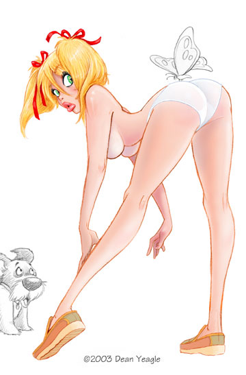
Rendered version, no skirt yet. First I render the whole figure; then, when I do the skirt on another level, I can adjust the transparency.
渲染过的版本,还没有裙子。首先我给整个图案着色,之后当我在另一层上描绘裙子的时候我就可以调整透明度。
图片十:
This step has taken a lot of small steps, but if I'd posted them all, the differences would not be that great; better, I thought, to show the major difference, and then explain. So here goes. I do the rendering by using levels first, and flattening as I go along. I will choose a reddish brown again, and lay down a flat color in what I will want to be a shaded area, and then use the Gaussian Blur on it...this takes a little experimentation, and I change the setting depending on the amount of blur I want. Then it's just a matter of doing that over and over, flattening when I'm sure I want what I've done, and adding different colors - red, blue, purple, brown, black, to the skin for various shadows or tones, and white for highlights.
这一步包括很多小步骤,但如果我贴出来所有的步骤,区别将不会很明显。所以我想还是把主要的区别展示出来比较好,然后解释。我也就这么做了。我着色首先使用层,然后如果自己觉得可以了,就拼合图层。我还会再选择一个泛红的棕色,然后涂上单色调颜色在我认为应该有阴影的地方,然后对阴影应用高斯模糊……这个需要一些实验,我根据我想要的模糊值改变设置,下面就是重复这种步骤。当我确定我搞好了,就拼合,然后加入一些不同的颜色,红、蓝、紫、棕、黑,给皮肤不同的阴影和色调,白色给高光。
I usually put a white line around the edges of the figure - a broken line, of varied widths, sometimes disappearing in the darkest shadows - but I find that makes the figure pop and acts as an indication of backlight. The line is WITHIN the outline of the figure.
我通常放一些白线条围绕图形边缘――一个断开的有不同宽度的线条,通常会在最暗的阴影处消失――但是我发现那使图案突出而且表现为背光痕迹。这个线条嵌在角色的轮廓中。
When the figure is rendered as I wish, I try one more effect - I make a copy of the figure level, choose the white BG area and delete it (and in this case, the butterfly and dog, too), and then do Image>Brightness/Contrast and darken it considerably. Doesn't matter how much, really, just so it's dark enough; I'll lighten it by taking down the opacity of that level when I'm done. Then I take a large, blurred edge brush on eraser setting, set to perhaps 50%, and take out areas on this darkened level that I want to appear as light. It's like painting with light. I'll bump up to 100% eraser for the lightest edges, and I usually make the eyes as bright as possible, even if the face is in shadow. Then I'll adjust the opacity of the level and that's where I am at this point.
当图形按照我期望的着色后,我尝试另一个效果,我做了一个图层拷贝,选择白色背景区,然后删除(在这个例子中包括蝴蝶和狗),再这样作:Image > Brightness/Contrast,做较多的暗化,真的不用担心多少,足够暗;我做完后,会通过降低那层的不透明度来加亮它。下面,我在擦除设置中选一个大的,边缘模糊的刷子,设置到50%,去处掉在这个暗化的图层中我期望表现为亮的区域。就好想使用光亮涂抹。我将为最亮的边缘,用一下子提高到100%的擦除工具,我通常让眼睛部分尽可能明亮。我还将调整现在我处理的层的不透明度。
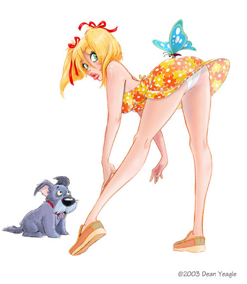
Not sure about the color of this sundress, actually, but here it is.
其实不太确定这夏装的颜色,不过它就在这里了。
图片十一:
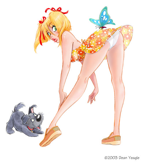
Okay, here's what I think is the final version before the background. New, more energetic and less Jockian pup, slight changes here and there, and a more energetic breeze as well.
好了,这就是我认为是最终版本了,除了背景。有些新的小变化,还有更生动的微风。
This is going to be made into a 3D print...I've been contacted by a gentleman in Oregon who has clued me into the amazing world of 3D. Not the simple 'anaglyph' (red/blue) ones I did and sold at the SD Con, but serious ones, made with great care and detail, and visible in two ways - one by crossing your eyes in the manner of those Magic Eye things which infested the Malls of America for a while a few years ago, but with single images instead of amazing and dopey shapes appearing out of unrelated pictures, and the other printed on cards and seen with viewers of the same sort as the old-time stereopican slides. He's done a few versions for me, including the Mandy with flower, and the effect is just terrific.
这将会制作成3D印刷……我联系了一位Oregon的绅士,他引导我进入神奇的三维世界。不是我做过的简单的浮雕(红/蓝)在SD角卖的那种,而是一个严肃的,细心的充满细节的制作,而且可以有两种方法看――一个是交叉双眼视线的方法,就像是几年前风行美国商场的魔术眼一样。但是是简单的图像,而不是一副图像从另一幅不相干的浮现出来。另一个方法是印刷在卡片上就像老式立体幻灯卡片那种类型。他为我做了一些版本,包括Mandy with Flower,效果真是太棒了。
图片十二:
出处:插画中国
责任编辑:moby
上一页 美式卡通绘画流程 [3] 下一页
◎进入论坛插画手绘交流版块参加讨论
|


