|
引言
其实自从Web2.0发展以来,一群关注视觉风格趋势的设计师们都在密切关注和推动着web2.0风格的进程,之前蓝色也和我谈到过web2.0的视觉风格问题,当时我说还需要一段时间来观察和归纳,
但当我看到乔纳山(Jonathan)在2006年10月21发表的“Web2.0的视觉设计”(The visual design of Web 2.0),在欣喜于全球设计师的关注焦点契合之余,也为文章中一些没有写出的东西想做一个表述,并且对文章中一些被翻译成中文后导致的误导以及对文章中一些观点的不同看法和补充做一个较全面的补充,让我们所有关心和关注web2.0视觉风格的设计师一起快速地“进化”。
在正式分类讲述之前,我还是建议大家去读一下乔纳山的原文,如果你愿意的话,我也给你提供一个我翻译的版本,我想,这个应该比charlee的中文翻译要好理解一些。
另外我觉得中国的设计师需要中英对照的学习,提高国际性,观念同步,词汇同步是很重要的,随后还会有一篇文章进行补充和总结。
The visual design of Web 2.0
Web2.0 的视觉设计
Posted by Jonathan on October 21st, 2006 in Typography, Graphic Design, Web Design
乔纳山 发表于 2006年10月21日,Quester 中文翻译于 2007年01月15日, 类别关键字:排版,图形设计,网页设计
原文链接:
http://f6design.com/journal/2006/10/21/the-visual-design-of-web-20/
If you didn’t blink, you may have noticed that for a few days recently Wikipedia’s entry for Web 2.0 included a subsection describing the visual elements of Web 2.0. Gradients, colorful icons, reflections, dropshadows, and large text all got a mention.
如果你不是太瞎的话,你可能会注意到前几天在 维基百科 的
Web2.0 条目下有一个子条目是关于 视觉元素 的。渐变,艳丽的图标,反射效果,下拉阴影,以及大号文字等值得一提的内容。
A few days later the “visual elements” addition had been removed after a vote by wikipedians. The objection, I suppose, is that no set of visual criteria can accurately define something as being characteristic of Web 2.0 - if Web 2.0 can be understood as an approach to generating and distributing content, then it needn’t be tied to a particular visual style.
过了几天“视觉元素”的添加条目就被维基成员投票否决并删除了。反对的原因,我估计是因为没有一套 视觉标准 能够准确的定义一些东西,就像Web2.0的特点――如果Web2.0可以理解为一种 信息内容的生成和分发途径,那就不必束缚于某一种视觉风格。
Nevertheless, it’s true that many Web 2.0 sites do share a distinctive aesthetic. Wikipedia’s editors may not think it’s a worthy part of the Web 2.0 discussion, but I say bring it on! Let’s take a look at the some of the communication issues facing a Web 2.0 site, and see how the “Web 2.0 look” can help to solve them.
就算是这样,许多Web 2.0站点有着同样独特的审美情趣却是事实。维基百科的编辑也许不认为这是Web 2.0的有价值的部分,但是我却说很必要!让我们来看一下面向Web2.0的沟通问题,并看看“Web 2.0外观”如何帮助解决问题。
Trust me, I’m Web 2.0
Integral to Web 2.0 is harnessing the input of website visitors. Users can generate content for a web service, promote it in a “viral” peer-to-peer fashion, and improve it’s data quality through their opinions and preferences.
相信我,我就是Web2.0
对于web2.0来说,不可或缺的是对网站访问者输入的驾驭。用户能自行创建网站服务的内容,以“病毒”般的点对点流行方式推广它,并且按照用户的意见和喜好来完善数据质量。
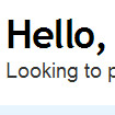
But to convince a visitor to contribute their time - and data - to a web application, you need to get them to trust you first. Most Web 2.0 sites come across as friendly, approachable and small-scale, using subtle design decisions to gain our trust.
但要说服访问者为网站程序花费时间和提供数据, 首先需要赢得他们的信任。多数Web2.0站点让我们觉得友好、平易近人、小规模,它们运用巧妙的设计来赢得大家信赖。
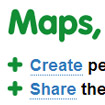
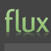
Green is the new grey
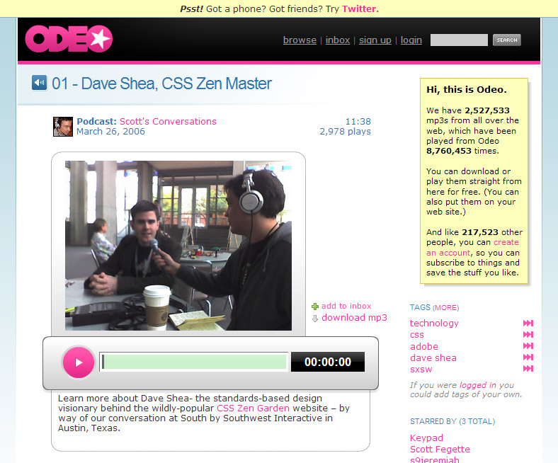
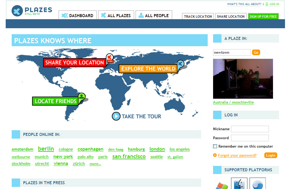
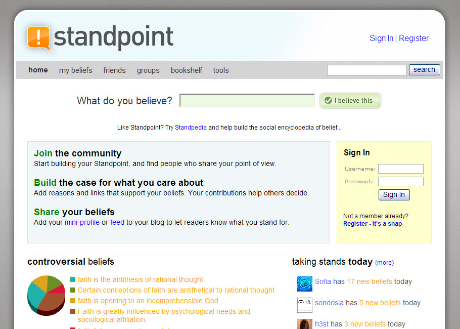
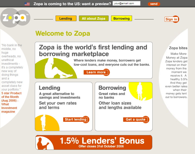
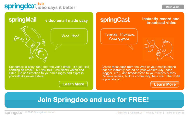
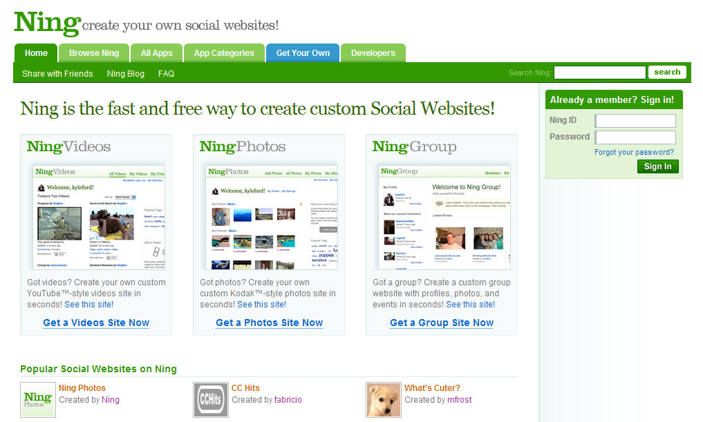
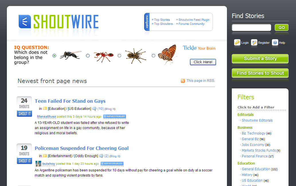
Bright, cheerful colors dominate Web 2.0 sites. Green is the unofficial color of web 2.0, but saturated blues, oranges and pinks are also favourites. Bold primary colors suggest a playful, fun attitude and also help to draw attention to important page elements.
绿色成为新宠
明快而生机盎然的色彩主宰了Web2.0网站。绿色是web2.0的非官方的色彩,并且高纯度的蓝色系,橙色系和粉红系也同样倍受青睐。 奔放的主色调引导了一种嬉戏的,愉快的态度,并且也有助于将注意力拉回到页面的重要元素上。
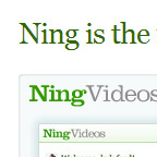
分别点击看大图
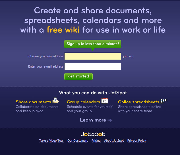
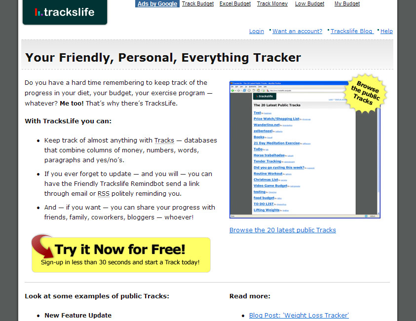
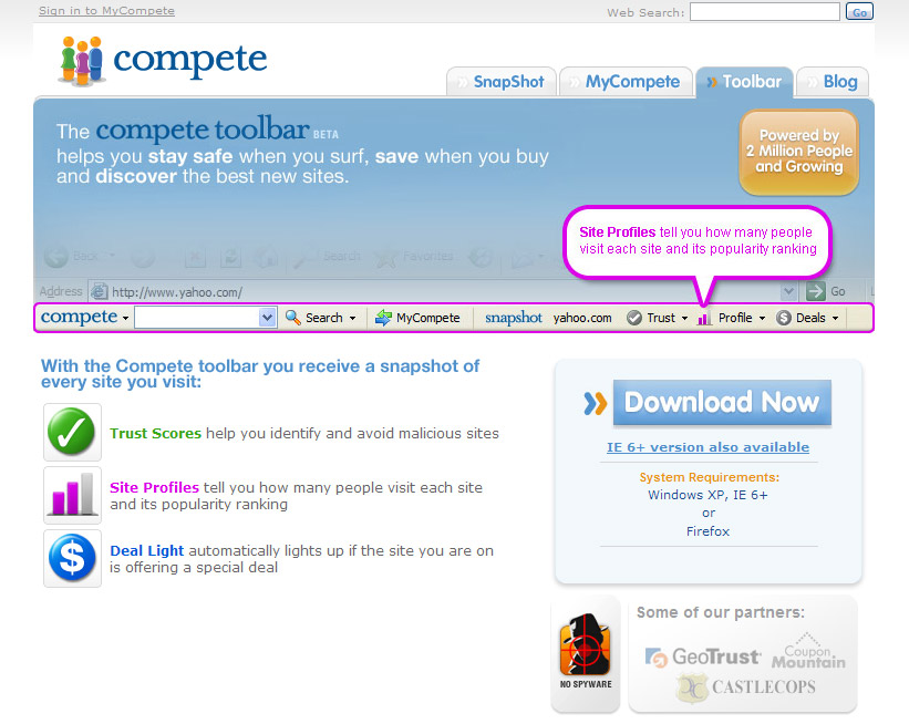
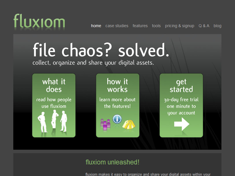
Rounded everything
New CSS techniques for achieving rounded corners have helped make this style hot again. The friendliness of rounded corners is in keeping with the comfortable, informal tone of many web 2.0 sites.
圆角无处不在
新的CSS技术支持圆的倒角使得这一风格又热了起来。友好的圆角效果让许多web2.0站点符合舒适的,无拘无束的基调。
In a great FontShop article analysing the logos of Web 2.0, it was clear that rounded typefaces are all the rage. This smooth approach to type lends a modern playfulness to a company’s visual identity.
在FontShop有一篇分析 Web 2.0 图标的精彩文章,明确表示圆角字体开始全面风靡。这种字体的柔和方式赋予了 企业视觉识别 一种现代的玩乐态度。
   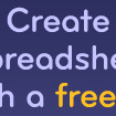
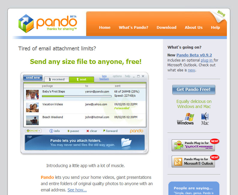
Free, as in beer
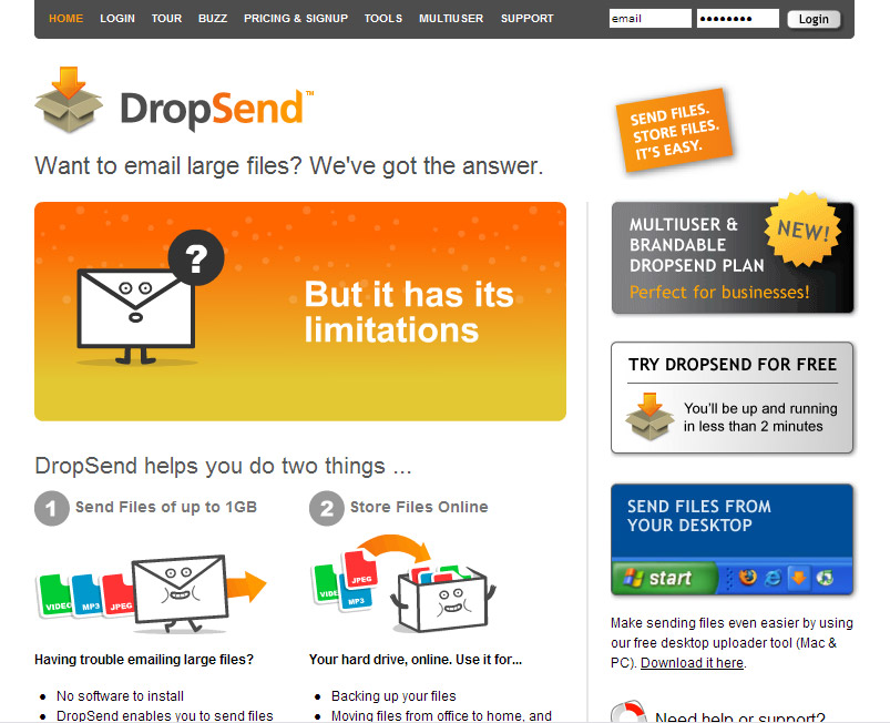
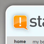
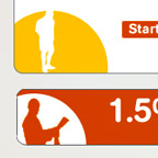
If you’ve got to convince visitors to sign up for your killer app, giving away FREE accounts surely can’t hurt. Most Web 2.0 sites devote prime real estate to the message that they offer a free service. If that message can appear inside of the ubiquitous ’starburst’, all the better.
免费,象啤酒那样
如果你已吸引访问者注册了你的终极程序,送给他们免费的账户而不要心疼。大多数Web 2.0站点花费主要资产来传达一个信息,那就是:他们提供免费服务。如果这个信息能显示在一个随处可见的光芒四射的 星型图案 里就再好不过了。
   
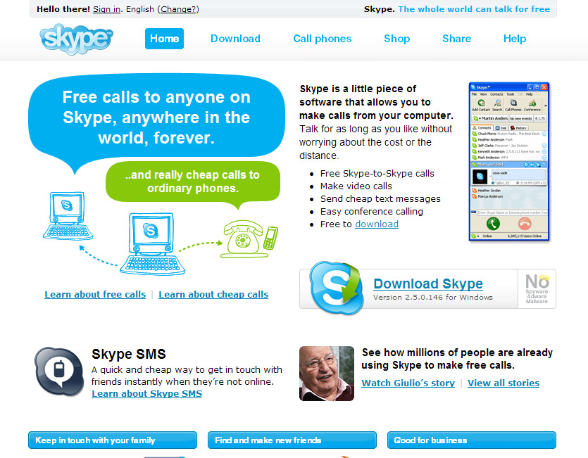
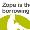
No (stock) photos please
You won’t find any stock photography of smiling support staff on a Web 2.0 site - that’s a tactic favored by small companies trying to mimic large corporations. Simple icons and screenshots are the order of the day when it comes to imagery on Web 2.0 sites. 3D and beveled icons can lend elegance and polish to a page design that is otherwise fairly stark.
拜托,不要(商用)照片
在web2.0网站,你不会找到任何一个微笑服务员工的商用版权相片。那是小公司假扮大公司形象惯用伎俩。当简单的图标和截屏图片作为Web2.0图像组成的一部分时,它成为我们今日的需求。使用立体而有斜边的图标能带给页面光洁优雅的气质,否则就会显得僵硬古板。
(Quester注:这一段尤其重要,在charlee的中文翻译中,将这段理解为“不要照片”,这是很不对的误导,原作者只是在强调对商业图库照片的使用说不,而不是所有图片,从Web2.0的参与性中可以理解这一点。)
   
Keep it simple stupid
Most Web 2.0 applications add an additional technological or organizational layer to the user’s web experience. Be it managing links with del.icio.us, sharing photos with flickr, or organizing tasks with Backpack, we have to familiarize ourselves with a new technological process and devote time to managing our content. A good Web 2.0 app ought to be lightweight and easy for users to grasp, and clever visual design and copywriting can help remove barriers to entry.
保持简单纯朴
大多数Web 2.0应用程序都会给用户体验中添加技术层面或者管理层面。如用del.icio.us来管理链接,用flickr来分享照片,或用backpack来安排任务,我们必须要熟悉这些新技术,并花些时间来管理我们的内容。一个好的Web 2.0程序应该短小精干并易于上手,而高明的视觉设计和文本能帮助我们去除入门的屏障。
Smart use of layout, color, type and copy can go a long way towards easing the pain.
巧妙地运用排版,色彩,字体和文本能使用户长时间地保持舒适而减轻痛苦。
Big is beautiful
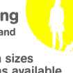
As far as Web 2.0 is concerned, bigger is definitely better. Bigger text, that is. Large text is easy on the eye, and coupled with snappy copywriting makes information easy to absorb. And now that accessibility is cool, it’s possible to be a hotshot web designer and use enormous type. Admittedly this craze for giant text strays too far into Jacob Nielsen territory for my taste - when a web page’s body text is set at larger than 13 point it looks like a “learning to read” book to me!
大就是美
对于Web2.0来讲,越大肯定是越好。大的文字就是。大的文字看起来不累,配合流畅的文字内容使得信息容易被吸收。我们现在强调“无障碍”沟通才是最酷的,做一个自命不凡的网页设计师是可能的,来用硕大的文字吧!确实这种用大字体的狂热跑得太远太离谱已经不合我的品味――当一个页面得正文字号大得超过13磅时,对我来讲看起来象一本低幼识字课本!
(Quester注:在charlee的中文翻译中,缺乏后面这段描述,因此会让人认为真的是“越大越好”)
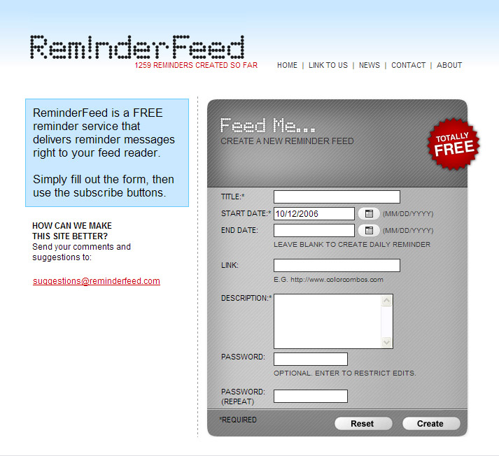
Breathing space
The layout of Web 2.0 sites might be described as minimal. With a focus on legibility and ease of use, good use is made of white space. White space allows important information to stand apart, provides rest for the eye, and imparts a sense of calm and order. Generous leading also makes text copy easier for the eye to follow. Some Web 2.0 layouts are so minimal that they verge on boring, but designed well, an uncluttered page can be incredibly tasteful.
呼吸空间
Web 2.0网站的排版布局(难度)可说是微乎其微。利用好空白可以使重点突出,易读,易用。空白能让重要信息凸显,让眼睛得以休息,并给予一种安定和秩序的感觉。宽松的行间距也让视线易于跟随文本流动。一些Web 2.0网站的布局简单到令人感到无聊的地步,但若设计上出色的话,一个四平八稳的页面也能成为绝顶的美味大餐。
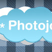
Clever copy
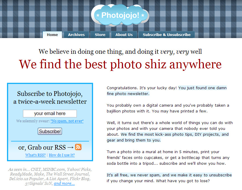
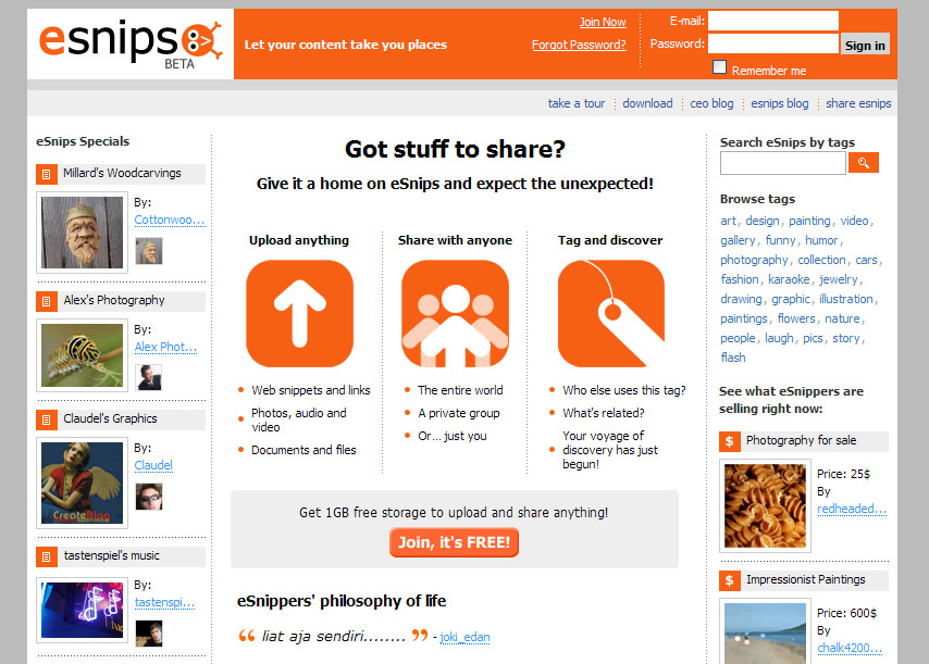
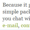
Friendly, informal copywriting allows a more personal relationship with website visitors. A List Apart singled out Flickr and Photojojo for an honorable mention in this department, and it’s a lesson that many Web 2.0 sites put into practice. WebTango isn’t just free, it’s “free of additives, cholesterol, ozone-depleting CFCs, and most importantly, free to use”. Tioti doesn’t just have tagging and RSS, it has “tagging and RSS up the yazoo”. FAQQLY founder David Liu isn’t a isn’t a faceless entity, Dave is “your first friend once you register”. And the toolbar on eSnips isn’t just flexible, it’s “a toolbar you can use in a bunch of cool ways”. You get the idea.
高明的文章
友好,活泼的行文方式会使作者与访问者建立更多良好的关系。A List Apart 功能让 Flickr 和 Photojojo脱颖而出就是这方面的一个好例证,这也是许多web2.0网站付诸实施的很好一课。WebTango 并不仅是免费,它是“无添加物,无胆固醇,无破坏臭氧层的氟利昂,还有最重要的就是,无收费使用”。Tioti不只是有标签和RSS,他有“标签和RSS奔涌如河流”。 FAQQLY的创始人David Liu不会不是一个可以面对的实体,他是“你成为注册用户后的第一个朋友”。还有,工具条在eSnips不只是“灵活”,它是“你能有一大堆超酷用法的工具条”。你有点子了。
Odds and ends
There are a couple of visual tendencies amongst Web 2.0 sites that don’t seem to answer a particular design problem, but deserve a mention nonetheless. The ‘wet table’ look, ’starbursts’ (also known as ‘flashes’ or ‘violators’), and ‘glass’ buttons, provide a lot of Web 2.0’s eye candy. Apple’s marketing department sure has a lot to answer for.
边角和收尾
有大量的视觉风格存在于Web2.0中,它们看起来并不能解答某一个特别的设计问题,尽管如此还是值得一提。“湿桌面”外观,“星形图案”(或称“星光闪耀”或“入侵者”),还有“玻璃”按钮,成就了Web2.0的大量“眼睛糖果”(愉悦眼球的玩意)。苹果的市场部肯定对此有许多答案。
Conclusion
So that’s my quick tour of the visual design of Web 2.0. Who knows, the “Web 2.0 look” may be out of vogue a year from now, but I think it offers good lessons about effective design for the web that deserve to have a much longer lifespan.
结论
这就是我对Web2.0的视觉设计的快速旅行。谁知道呢,也许“Web 2.0外观”从现在算起一年后就会过时,但是我认为它提供了关于 网站特效设计 的一些好课程,这方面值得拥有更长的生命力。
出处:蓝色理想
责任编辑:蓝色
|