|

点击放大
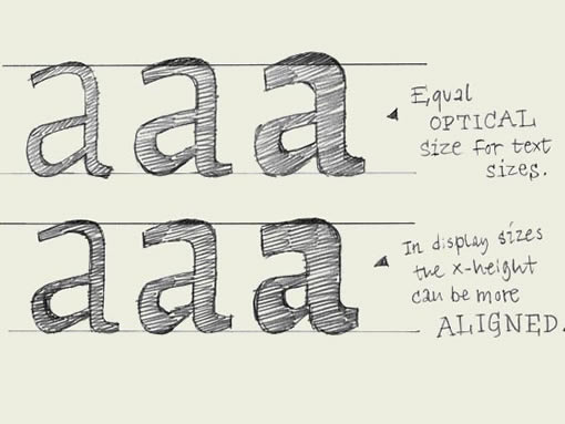
图中文字:
上右:正文字体拥有一致的视觉高度。(而物理尺寸是不一样的)
下右:特排字体的x高度更偏向于物理尺寸上的一致。
x-heights. If you make a light weight and the black weight of one typeface, you'll have to make sure that the black weight has a bigger x-height than the light weight (top line drawing). If this is not the case, the black weight will look optically too small when it's combined with the light weight in a line of text.
如果你制作一个包含轻磅(细线体)和重磅(粗黑体)的字体,你应该确保粗黑体的x高度应当比细线体的略大(见图中上一行)。否则,当粗黑体和细线体在同一行中连排时,粗黑体看上去就要比细线体要小得多。
In display sizes this is not exactly the same. If the type is printed in big sizes there can be a much smaller difference between the x-height of the light and the black weight (bottom line drawing).
但在特排使用中,情况就不太一样。当字体大字号印刷时,两者的x高度之间的差异就微乎其微了(参见图中下一行)。
英文原文
本文链接:http://www.blueidea.com/design/doc/2007/5155.asp 
出处:蓝色理想
责任编辑:tada
|


