|
 5. 3d Puffies 5. 3d Puffies
With these new puffed-up Logos, you don't know whether to click on them or bounce on them. Now that the industry has overcome the production issues of gradients, designers seem to prefer air-popped graphics to the flat drawings of yore. Even desktop icons these days seem to have a rounded feel, like you might pop one with one good hard double-click. It's a 2D world out there in Internet land, and these 3D images really make Web pages and Logos jump out of the page, to where you feel you could run your hands over the computer screen and feel their bumps and curves.
5. 立体发泡物
这些新出现的圆鼓鼓发泡Logo,让你搞不懂到底是在上面点击还是在上面弹跳。自从工业生产克服了“渐变色”的难题,设计师们就似乎热衷于将“立体弹出”的图像加到以往的平面图样中。甚至桌面图标在最近也看起来有圆乎乎的感觉,就像你用力一点击它就会弹得老高。二维的世界已经从互联网走开了,三维的图像的确让网页和Logo“跳出”页面,进入一个你可以用手指满屏幕去感觉那些凹凸不平和曲线的新世界。
|
|
6. Hot Dogs
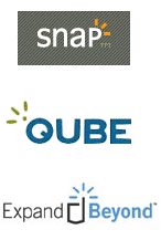
These cute little Tic Tacs of color are popping up all over the design world. Like many abstract symbols, the hot dogs can be used to mean many different things. Sometimes they denote movement or sound, such as in the Logo for Snap. These lines, reminiscent of those drawn out of shocked cartoon people by children everywhere, can denote an idea, a feeling or a literal meaning. But no matter how they're used in design, they are a powerful symbol of an upbeat emotion. |
|
|
6. 热狗肠
这些色彩和弹出的可爱小把戏遍布了整个设计界。像许多抽象符号一样,热狗肠可以用来表示许多不同的东西。又是他们表示声音或运动的 警示,就像Snap的Logo里那样。那些辐射的线条,让人想起随处可见的小孩子画的 大吃一惊的 卡通人物。它能表示一种想法,一种感觉或者只是一种 字面上的意义。但不管它们用在设计中是为什么,它们都是一种有强烈表现力的符号来象征 乐观的态度。 |
|
|
7. Transmission beam
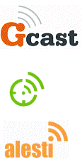
With satellite tv and radio and wireless everything all the rage in the new millennium, a transmission beams are a quick way to show that they are on the cutting edge of technology. Many companies who use this Logo trend deal in internet information. Part of what many of these companies are doing on the internet is taking user (or customer) information and sharing it with the world. The transmission beam, starting with a single dot (to represent the user), shows their ideas spreading out. It's the perfect symbol for publishing companies or blog sites. |
|
|
7. 发射电波
卫星电视,电台和无线的东东在新纪元里遍地开花,用发射电波是最快捷方式来表明他们是站在科技的最前沿。用这种Logo的许多公司都在做互联网信息生意。他们中间有许多公司做的是在互联网上获取用户(客户)资料然后分享给全世界。无线电波,始发于一个“点”(代表用户),体现他们的理念在传播。对于出版公司和博客网站来讲,这是个完美的符号。 |
出处:蓝色理想
责任编辑:蓝色
上一页 2007年标志设计趋势密码 [1] 下一页 2007年标志设计趋势密码 [3]
|


