|
点击放大
图上文字:
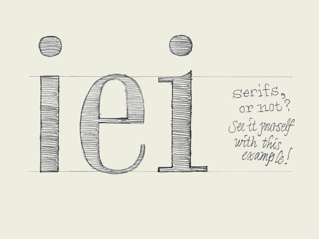
衬线还是无衬线?看上图,你自己决定。
One for all What defines if one character can fit to another character? Once you made a decision, how to apply this to all the other characters in a font?
是什么决定一个字符能否匹配另一个字符?当你确定了一种风格,如何将之推广应用于字库中的全部字符?
Starting point: 'e' (in the center of the drawing). Imagine you sketched this 'e', you like it a lot, and now you want to design more characters fitting to this 'e'. Where to start? Should it be a serif or a sans serif for example?
先从这里开始:图中有一个“e”。想象你刚画好这个“e”的草图,你很喜欢它,然后你想要设计更多的其他字符来匹配这个“e”。该如何开始呢?比如说,它应该是一个衬线字体还是一个无衬线字体呢?
First try: 'i' on the left. Sans serif. The black part is as thick as the black parts of the 'e'. Same x-height. So this should work you think.
第一个尝试:左边的“i”,无衬线体。它最粗的部分和“e”最粗部分的笔画宽度相同,同样的x-高度。它应该能表达你的想法了。
Second try: 'i' on the right. Same thickness, the character has the same x-height, but now it has serifs.
第二个尝试:右边的“i”。同样的宽度,同样的x-高度,但这次它有了衬线。
The bowl of the 'e' is not only having a certain thickness, but the 'e' also has contrast. The 'i' on the left has no contrast at all. Therefore these two characters don't belong to each other. The 'i' on the right however has the same kind of contrast as the 'e', just because it has serifs. Just those tiny serifs make sure there are thick and thin parts, like the 'e' has. This means that the starting point, the 'e', already defined that the rest of the font cannot be a sans serif typeface.
“e”的字碗不仅仅有着一定的宽度,同时还有着粗细的对比。左边的“i”完全没有笔画粗细的对比。因此这两个字符不是完美的一对。而右边的“i”有着和“e”同样的粗细对比,是因为它有了衬线。这细细的衬线让它象“e”那样拥有了粗细的区别。这就是起点。这个“e”,已经决定了这个字体中的其余字符不应该是一个无衬线字体。
Of course, every so called rule is there to be broken. Mentioning this, doesn't mean you can't make a font which has an 'e' combined with an 'i' like the one on the left. Everything is possible of course. But now you realize better what you are doing, also when you don't do it. Still get it?
当然了,每一条所谓的规则到最后都会有例外。从这个意义来说,你完全可以把中间的“e”和左边的“i”配一对做一个字体。没有什么是不可能的。但现在你已经能够更深刻的意识到你为什么这样做,抑或是你为什么不那样做。还能理解吗?
英文原文
本文链接:http://www.blueidea.com/design/doc/2007/5150.asp 
出处:蓝色理想
责任编辑:tada
|