|
点击放大
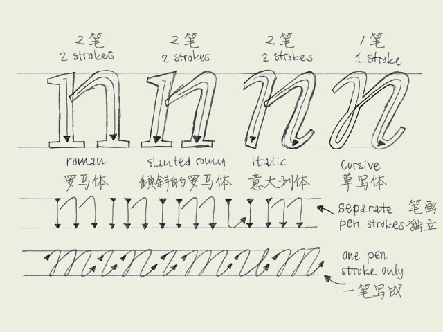
Italic vs. cursive. A roman font can be slanted (having an angle) and a cursive font can be upright (totally vertical like a roman). Urgh!
一个罗马体(roman,通常也被译作”正体“)可以是倾斜的(有一定的倾角),而一个草写体可以是竖直的(就好像是一个正体一样)。呃?!
The angle doesn't decide if a character is a 'roman' character or an 'cursive' character. This depends on the construction. To make it a bit more clear, take a look at the four big n's. As you would expect, the first letter is a roman character. But the second one as well. Although it's not totally vertical, it still has the same construction as the first 'n'. This is called a slanted roman. The third 'n' looks like an cursive, but also this one is not a real cursive. Basicly there is no difference between the second and third 'n', only some parts of the serifs have been cut off.
倾角并不能决定一个字母是一个“罗马体”还是一个“草写体”。关键在于其结构。要理解这一点,看看下面四个大n。你想的没错,第一个是一个罗马体。但第二个同样也是,虽然它并不是完全的竖直,它和第一个n拥有同样的结构。这种情形我们叫做倾斜的罗马体。第三个n看起来很象草写体了。但它实际上还不是一个真正的草写体。总的来说第三个n和第二个并没有多大区别,只是衬线的个别部分被切掉了而已。
Compare the first three letters with the last 'n'. That's a real cursive. The big difference with the previous three is the construction. The first three are constructed from separate pen strokes. The last 'n' is constructed out of one pen stroke. This is the basic difference between roman and cursive fonts. Not the angle, but the construction.
与前面三个n相比,最后一个n才是真正的草写体。它们之间最大的区别在于结构。前三个n的各个笔画之间都是独立的。最后一个n完全是一笔写成的。这就是罗马体和草写体之间最根本的区别:不在于倾角,而在于结构。
Many different explanations can be given for the difference between a 'cursive' and 'italic' from a historical point of view. However we consider this as the big difference: 'italic' is concerning the function, 'cursive' is concerning the construction. Almost anything can work as an 'italic', it doesn't even necessarily needs an angle. When making a font family with a roman and an italic font, the italic font can be constructed in many different ways. The third 'n' in the example could probably function perfectly as an italic inside your family. But don't forget, it's not always a real cursive when it's called 'italic'.
如果要从历史的视角来探讨草写体和“意大利体”之间的区别,那就说来话长了。但我们可以从这个角度来考虑:“意大利体”关乎功能,而“草写体”关乎结构。几乎任何字体都可以当成一个“意大利体”来使用,甚至根本不需要有什么倾角。当你制作一个包含“罗马体”和“意大利体”的字体家族时,这个“意大利体”可以用各种不同的方式来构建。图例中的第三个n也许就是你字体家族中一个完美的“意大利体”。但不要忘了,一个叫做“意大利体”的字体不一定是一个草写体。
译注:这篇翻的比较别扭。roman一般译作“正体”,italic译作“斜体”,严格来讲都不是准确的翻译,但却已经是约定俗成的翻译了。正确的翻译应该是“罗马体”和“意大利体”。在Windows上,对99%的用户来说,italic就是斜体的意思,word里面甚至为所有字体都提供了一个“斜体”的功能。但实际上“意大利体”指的是一类字体的统称,并且也并非所有的“意大利体”都是倾斜的。西方拉丁文字系统最早在古罗马帝国形成完整的体系,代表作品就是古罗马的石刻文字,非常庄严而典雅。而后来意大利人从手写体中发展出了意大利体。随着印刷术的发展,意大利体一般用来作为正文字体的一种特殊强调样式,用于注释、引文之类的场合,与正文字体相区别。因此许多比较完备的字体家族都提供了一个叫做“意大利体”的变体,和其正体(罗马体)相比,有些字体中的“意大利体”的字形完全是经过重新设计的,而不仅仅是倾斜那么简单。)
要了解更多有关意大利体的信息,可以参看下面这篇文章。
http://www.logosky.net/webpage/artreview/italic_font_20060916.htm
英文原文
本文链接:http://www.blueidea.com/design/doc/2007/5149.asp 
出处:蓝色理想
责任编辑:tada
|