|
点击放大
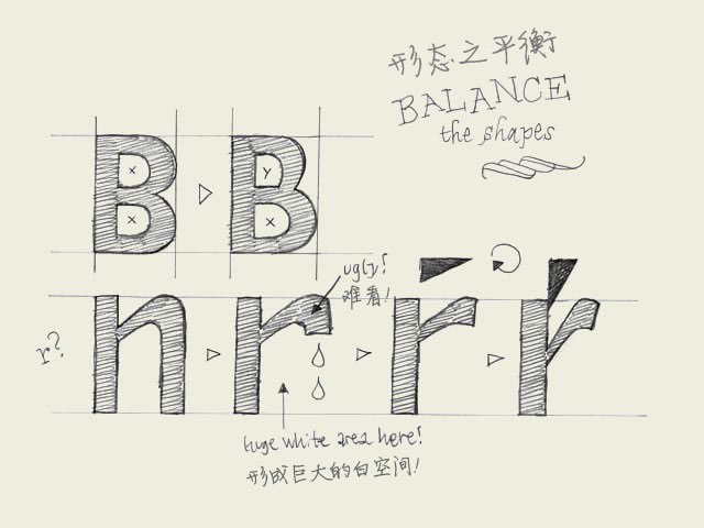
Balance shapes. If you make both of the inner forms (counters) of the 'B' exactly the same, the top counter will optically look bigger. Your character will look plumby, like it's falling down. If you make the top counter smaller than the bottom one, your character looks much more balanced.
如果你把字母“B”上下两个内部形状(字怀)弄得完全一样,上面的字怀在视觉上就会更大。你的字母看上去就好像站立不稳,摇摇欲坠。如果你把上面的字怀弄得小一些,整个字符看起来会更平衡。
The counter of the 'B' doesn't have to be exactly the same as the counter of the 'P' for example. If you would make them exactly the same, the right sidebearing of the P would be much too big. So you have to balance the black and white spaces in every character separately. However, there must be a relationship between the amount of white space inside a 'B' and inside a 'P'.
同样的,字母“B”字母“P”的字怀也不需要完全一样。如果两者完全一样,“P”的右部空间就显得太大了。所以对每个字符的黑白空间你都要进行单独的平衡。但是,“B”和“P”两者内部白空间的大小一定存在着某种关联。
About making a lowercase 'r': it's not an 'n' with an amputated leg. Your 'r' can get very weak and soft in that way. You can make it much stronger if you let the ending of the 'r' follow the horizontal reading direction. In that way, the space on the right side of the 'r' will be more open, and more balanced. It will not disturb the rhythm of your type because the right sidebearing can be much smaller. The whole letter can be made more narrow as well. As a consequence the white space in the top of the 'r' could be has to be changed. In case you change that form, optically you'll not confuse the 'r' so quickly with the 'n' as well.
说到怎样做一个小写的“r”:它绝对不是一个把一边腿锯断的“n”。如果那样做,你的“r”会被弄得非常的虚弱。如果你让“r”的末笔顺着水平的阅读方向,就可以让它看上去更健壮。同时“r”的右部空间会更开放,更平衡。这不会有损于字体的节奏,因为“r”右部的安全空间可以设置得非常小。整个字母可以做的更窄。这样一来,“r”顶部的白空间就不得不改变。形状改变之后还有一个好处,你就不会在匆匆一瞥之下把“r”错看成“n”。
译注:
sidebearing 字符前后预留的安全空间(或者叫缓冲区),以避免前后字符笔画发生碰撞。分为左部空间和右部空间。
参考链接:http://www.myfirstfont.com/glossary.html
英文原文
本文链接:http://www.blueidea.com/design/doc/2007/5159.asp 
出处:蓝色理想
责任编辑:tada
|