|
点击放大
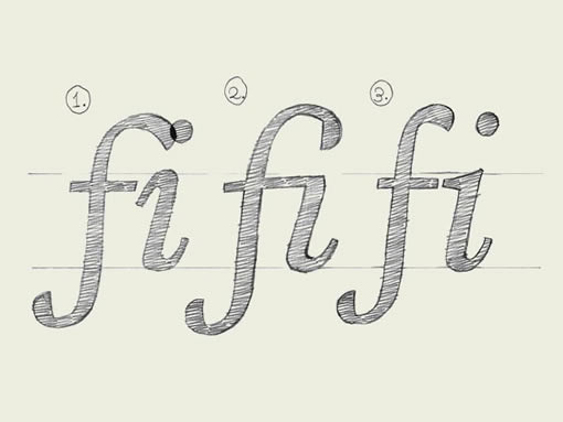
Ligatures. In a very few cases they are essential. Some well known ligatures are 'fi' and 'fl'. The inevitable need for a ligature is depending on the design of a font. Not every typeface will need a ligature for a 'fi' combination. But in some cases the dot of the 'i' is interfering with the 'f'. Get rid of all that annoying row but making a ligature, one glyph which represents two (or more) characters. Next to a functional aspect, there is an aesthetic aspect of ligatures. You could create a ligature for a 'st' combination, or maybe for 'nky' or 'ism'. Anything is possible. Admitting that also this is not the most urgent issue in type design, it's another obstacle on the road to perfection!
只有极少数的场合才需要用到连字。比较常见的连字有“fi”和“fl”。连字是否必不可少,取决于字体的设计。不是每种字体都需要"fi"的连字组合。但有些时候字母“i”上面的圆点会和前面的“f”相撞。一劳永逸的解决方案是做一个连字,用一个字符代替两个(或更多的)字符。连字的出现的原因,除去功能上的需要,还有审美意义上的。你可以做一个“st”的连字组合,或是一个“nky”或“ism”。任何字符都是有可能的。这个章节同样也不是学习字体设计最迫切需要的知识,但这是通向完美之路上另一道必须逾越的障碍。
(译注:到今天为止,整个《字体设计基础》系列文章就全部翻译完了。了却一桩心事。感谢大家一直以来的支持。)
英文原文
本文链接:http://www.blueidea.com/design/doc/2007/5161.asp 
出处:蓝色理想
责任编辑:tada
|


