|
�����ף����ڰѵڶ�����У�����ˡ����һ�ڷ��ñȽϳ������϶��в��Եĵط����д��·��������ָ�㡣
2007-4-27���巭����� ����,Ŀ�굼������
2007-5-9 ������
ֽ��ԭ��--�ڶ�����

Tips for Good Paper Prototypes �õ�ֽ��ԭ�ͼ���
- Make larger than life
��ʵ�ʵĴ�
- Make it monochrome
ʹ�õ�ɫ
- Replace tricky visual feedback with audible descriptions-- Tooltips, drag & drop, animation, progress bar
�����ü�������������ӻ��ķ�����������ʾ����ק��������������
- Keep pieces organized-- Use folders & open envelopes
��֯��ԭ��Ƭ�ϡ�ʹ���ļ��л��ŷ�
A paper prototype should be larger than life-size. Remember that fingers are bigger than a mouse pointer, and people usually write bigger than 12 point. So it��ll be easier to use your paper prototype if you scale it up a bit. It will also be easier to see from a distance, which is important because the prototype lies on the table, and because when you��re testing users, there may be several observers taking notes who need to see what��s going on. Big is good.
ֽ��ԭ��Ҫ��ʵ�ʳߴ��ס��ָҪ�����ָ�������ͨ��д��Ҫ����12�㡣���ԣ��Ŵ�һ��ԭ�ͣ���ԭ������ʹ�ã�ͬʱ����һ���ľ�������ۿ���������Ҫ����Ϊԭ��ͨ��ƽ���������ϡ���Ϊ�����û����Ե�ʱ�����м����۲�����Ҫ�ۿ����Թ��̣�ͬʱ���ʼǡ����ԣ���һ��ã�
Don��t worry too much about color in your prototype. Use a single color. It��s simpler, and it won��t distract attention from the important issues. Needless to say, don��t use yellow.
���ù��ൣ�����ԭ�͵�ɫ�ʡ��õ�ɫ����������࣬����������Ҫ�������Ϸ�ɢע����������˵����Ҫʹ�û�ɫ��
You don��t have to render every visual effect in paper. Some things are just easier to say aloud: ��the basketball is spinning.�� ��A progress bar pops up: 20%, 50%, 75%, done.�� If your design supports tooltips, you can tell your users just to point at something and ask ��What��s this?��, and you��ll tell them what the tooltip would say. If you actually want to test the tooltip messages, however, you should prototype them on paper.
�㲻����ֽ����Ⱦÿ���Ӿ�Ч����һЩ���������˵������������������ת�����������ﵽ��20% 50% 75% ������������ṩ������ʾ�����û�ָ��ij�������ʡ�����ʲô������ֻ��Ҫ�����û�������ʾҪ�������˼�������������Թ�����ʾ��Ϣ����ô�����������ǵ�ԭ�ͻ���ֽ�ϡ�
Figure out a good scheme for organizing the little pieces of your prototype. One approach is a three-ring binder, with different screens on different pages. Most interfaces are not sequential, however, so a linear organization may be too simple. Two-pocket folders are good for storing big pieces, and letter envelopes (with the flap open) are quite handy for keeping menus.
���һ���õļƻ�����֯ԭ�͵���ɲ��֣�һ���ӽ��ķ�����������У��ò�ͬ����Ļ�ڲ�ͬ��ֽ���ϣ����������Ƿ������ģ�Ȼ�������Ե���֯δ��̫��.���������ļ��кܺ�������Ŵ��ԭ�ͣ��ŷ�����������Ʋ˵��IJ��ַdz�˳�֡�
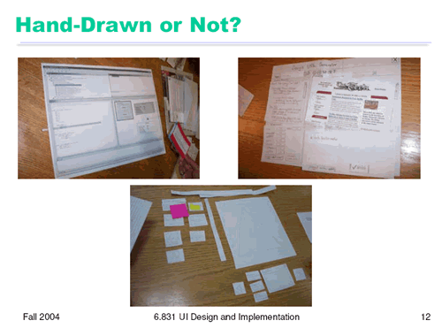
Hand-Drawn or Not?�ֻ棿
Here are some of the prototypes made by an earlier class. Should a paper prototype be hand-sketched or computer-drawn? Generally hand-sketching is better in early design, but sometimes realistic images can be constructive additions. Top left is a prototype for an interface that will be integrated into an existing program (IBM Eclipse), so the prototype is mostly constructed of modified Eclipse screenshots. The result is very clean and crisp, but also tiny �C it��s hard to read from a distance. It may also be harder for a test user to focus on commenting about the new parts of the interface, since the new features look just like Eclipse. A hybrid hand-sketched/screenshot interface might work even better.
������һЩǰ��������ԭ�͡�ֽ��ԭ����Ӧ���ֻ��ͼ���Ǽ������ͼ�أ�ͨ��������������У��ֻ��ͼ���ã����ǣ���ʱ����ʵͼƬ����ʵ�ʿ��ǣ����ӣ������ϱ���һ����Ʒ����ԭ�ͣ������Ʒ���һ���Ѵ��ڵĵij������ϣ�IBM Eclipse������ˣ�ԭ�ͼ������ڸĽ����Eclipse��Ļ��ͼ֮�Ϲ������ɹ�������ɴࡣ����Ҳ̫С���뿪һ�ξ����Ķ��ͱȽ����ѡ�����ڲ����û���ע������������������������һ�����Ѷȣ���������ۿ�����ǡǡ����Eclipse��������һ����ϵ��ֻ����Ļ��ͼ�Ľ�����ܸ����á�
The top right prototype shows such a hybrid �C a interface designed to integrate into a web browser. Actual screenshots of web pages are used, mainly as props, to make the prototype more concrete and help the user visualize the interface better. Since web page layout isn��t the problem the interface is trying to solve, there��s no reason to hand-sketch a web page.
���϶˵�ԭ�;�չʾ��������һ�������ʽ����һ������������Ͻ���ҳ������С�ʹ������ʵ����ҳ��ͼ������ʹ�õ���һ����ʹԭ������ʹ�û����õ������档��Ϊ��ҳ���ֲ��ǽ���Ҫ��������⣬���ԣ�û�б�Ҫ��ȥ�ֻ�һ����ҳ��
The bottom photo shows a pure hand-sketched interface that might have benefited from such props --a photo organizer could use real photographs to help the user think about what kinds of things they need to do with photographs. This prototype could also use a window frame �C a big posterboard to serve as a static background.
��������ͼչʾ��һ�����ֻ�Ľ��棬���������������ЩС����---ͼƬ��֯�߱���ʹ����ʵ��ͼƬ�����û�������ʹ��ͼƬ��ʲô�����ԭ��Ҳ����ʹ��һ��Windows����--һ����װ壬�����װ���ǡ���̬������
���������ǽ������
���α༭��moby
��һҳ ��һҳ ֽ�������������Ʒԭ�͵ķ��� [2]
|


