|
Size Matters
���ڳߴ�
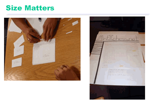
Both of these prototypes have good window frames, but the big one on the right is easier to read and manipulate.
������ԭ�Ͷ��кõĴ��ڿ�ܣ������ұ��Ǹ���ĸ������Ķ�������������

The Importance of Writing Big and Dark
�����д�ͣ��������Ϳɫ����Ҫ��
This prototype is even easier to read. Markers are better than pencil. (Whiteout and correction tape can fix mistakes as well as erasers can!) Color is also neat, but don��t bother unless color is a design decision that needs to be tested, as it is in this prototype. If color doesn��t really matter, monochromatic prototypes work just as well.
���ԭ�պø������Ǻűʵı�Ǧ�ʸ��ã����ɫ���������Ĵ����ܹ�������ʹ����Ƥ���Ч������ɫ��Ҳ�Ǵ�ɫ�����ǣ���Ҫ�����ɫ��������������ƶ�����Ҫ���������ԣ�������������������ġ������ɫ����ʵ����Ҫ������õ�ɫԭ�͡�

Post-it Glue and Transparencies are Good
Post-it��ˮ������Ƭ�Ǻö���
The prototype on the left has lots of little pieces that have trouble staying put. Post-it glue can help with that.
���ԭ��������С��ֽƬ�������ǹ̶��е��鷳��Post��it��ˮ�ܹ���������ṩ������
On the right is a prototype that��s completely covered with a transparency. Users can write on it directly with dry-erase marker, which just wipes off �C a much better approach than water-soluble transparency markers. With multiple layers of transparency, you can let the user write on the top layer, while you use a lower layer for computer messages, selection highlighting, and other effects.
��ͼ��ԭ����ȫ������Ƭ���ǣ��û��������ֱ���ø��Կɲ�������˱���д�������������ˮ�Կ��ܽ���˱ʺá�ʹ�ö������Ƭ����������û��ڶ�����д��ͬʱ�������²�չʾ�������Ϣ��������ʾѡ�������Ч����
���������ǽ������
���α༭��moby
��һҳ ֽ�������������Ʒԭ�͵ķ��� [1] ��һҳ ֽ�������������Ʒԭ�͵ķ��� [3]
|


